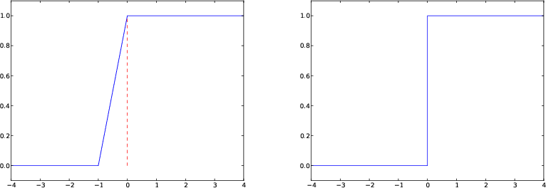
Figure 8: Plot of the Heaviside function using 9 equally spaced \( x \) points (left) and with a double point at \( x=0 \) (right).
This chapter is taken from the book A Primer on Scientific Programming with Python by H. P. Langtangen, 5th edition, Springer, 2016.
The previous examples on plotting functions demonstrate how easy it is to make graphs. Nevertheless, the shown techniques might easily fail to plot some functions correctly unless we are careful. Next we address two types of difficult functions: piecewisely defined functions and rapidly varying functions.
A piecewisely defined function has different function definitions in different intervals along the \( x \) axis. The resulting function, made up of pieces, may have discontinuities in the function value or in derivatives. We have to be very careful when plotting such functions, as the next two examples will show. The problem is that the plotting mechanism draws straight lines between coordinates on the function's curve, and these straight lines may not yield a satisfactory visualization of the function. The first example has a discontinuity in the function itself at one point, while the other example has a discontinuity in the derivative at three points.
Let us plot the Heaviside function $$ \begin{equation*} H(x) = \left\lbrace\begin{array}{ll} 0, & x < 0\\ 1, & x\geq 0 \end{array}\right. \end{equation*} $$ The most natural way to proceed is first to define the function as
def H(x):
    return (0 if x < 0 else 1)
x
and call y = H(x) will not work for array arguments x, of reasons
to be explained in the section Vectorization of the Heaviside function. However, we may
use techniques from that chapter to create a function Hv(x) that
works for array arguments. Even with such a function we face
difficulties with plotting it.
Since the Heaviside function consists of two flat lines, one may think that we do not need many points along the \( x \) axis to describe the curve. Let us try with nine points:
x = np.linspace(-10, 10, 9)
from scitools.std import plot
plot(x, Hv(x), axis=[x[0], x[-1], -0.1, 1.1])
x2 = np.linspace(-10, 10, 50)
plot(x, Hv(x), 'r', x2, Hv(x2), 'b',
     legend=('5 points', '50 points'),
     axis=[x[0], x[-1], -0.1, 1.1])
plot([-10, 0, 0, 10], [0, 0, 1, 1],
     axis=[x[0], x[-1], -0.1, 1.1])
Figure 8: Plot of the Heaviside function using 9 equally spaced \( x \) points (left) and with a double point at \( x=0 \) (right).
Some will argue that the plot of \( H(x) \) should not contain the vertical line from \( (0,0) \) to \( (0,1) \), but only two horizontal lines. To make such a plot, we must draw two distinct curves, one for each horizontal line:
plot([-10,0], [0,0], 'r-', [0,10], [1,1], 'r-',
     axis=[x[0], x[-1], -0.1, 1.1])
Figure 9: Plot of a hat function. The solid line shows the exact function, while the dashed line arises from using inappropriate points along the \( x \) axis.
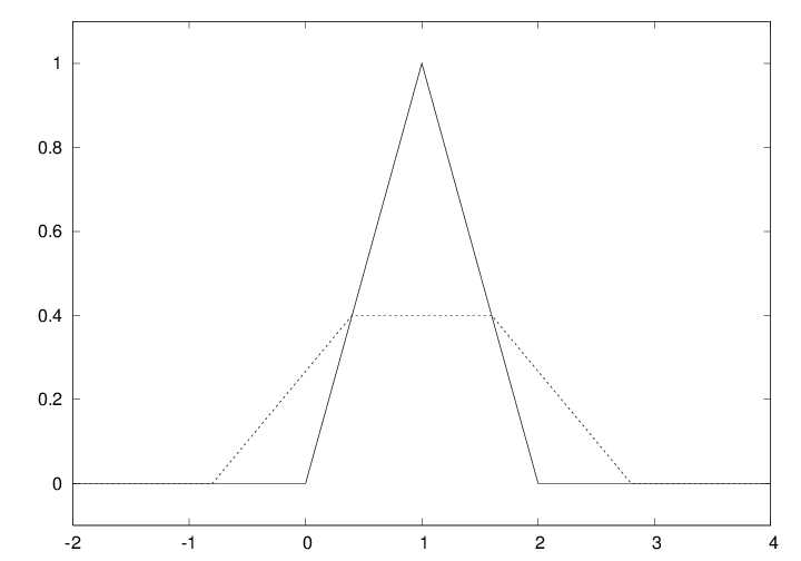
Let us plot the hat function \( N(x) \), shown as the solid line in Figure
9. This function is a piecewise linear function. The
implementation of \( N(x) \) must use if tests to locate where we are
along the \( x \) axis and then evaluate the right linear piece of \( N(x) \).
A straightforward implementation with plain if tests does not work
with array arguments x, but the section Vectorization of a hat function explains
how to make a vectorized version Nv(x) that works for array
arguments as well. Anyway, both the scalar and the vectorized
versions face challenges when it comes to plotting.
A first approach to plotting could be
x = np.linspace(-2, 4, 6)
plot(x, Nv(x), 'r', axis=[x[0], x[-1], -0.1, 1.1])
x vector, which does not contain the points \( x=1 \) and \( x=2 \)
where the function makes significant changes. The result is that
the hat is flattened. Making an x vector with all
critical points in the function definitions, \( x=0,1,2 \), provides
the necessary remedy, either
x = np.linspace(-2, 4, 7)
x = [-2, 0, 1, 2, 4]
x alternatives and a plot(x, Nv(x))
will result in the solid line in Figure 9,
which is the correct visualization of the \( N(x) \) function.
As in the case of the Heaviside function, it is perhaps best to drop using vectorized evaluations and just draw straight lines between the critical points of the function (since the function is linear):
x = [-2, 0, 1, 2, 4]
y = [N(xi) for xi in x]
plot(x, y, 'r', axis=[x[0], x[-1], -0.1, 1.1])
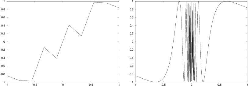
Let us now visualize the function \( f(x) = \sin (1/x) \), using 10 and 1000 points:
def f(x):
    return sin(1.0/x)

from scitools.std import linspace, plot
x1 = linspace(-1, 1, 10)
x2 = linspace(-1, 1, 1000)
plot(x1, f(x1), label='%d points' % len(x))
plot(x2, f(x2), label='%d points' % len(x))
Another problem with the \( f(x)=\sin (1/x) \) function is that it is easy
to define an x vector containing \( x=0 \), such that we get division
by zero. Mathematically, the \( f(x) \) function has a singularity at \( x=0 \):
it is difficult to define \( f(0) \), so one should exclude this point from
the function definition and work with a domain \( x\in [-1,-\epsilon]\cup
[\epsilon,1] \), with \( \epsilon \) chosen small.
The lesson learned from these examples is clear. You must investigate the function to be visualized and make sure that you use an appropriate set of \( x \) coordinates along the curve. A relevant first step is to double the number of \( x \) coordinates and check if this changes the plot. If not, you probably have an adequate set of \( x \) coordinates.
Figure 10: Plot of the function \( \sin(1/x) \) with 10 points (left) and 1000 points (right).