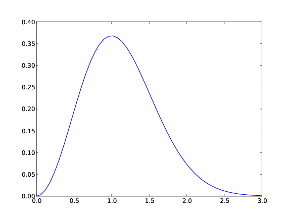
Figure 2: A simple plot in PDF format (Matplotlib).
This chapter is taken from the book A Primer on Scientific Programming with Python by H. P. Langtangen, 5th edition, Springer, 2016.
Visualizing a function \( f(x) \) is done by drawing the curve \( y=f(x) \) in an \( xy \) coordinate system. When we use a computer to do this task, we say that we plot the curve. Technically, we plot a curve by drawing straight lines between \( n \) points on the curve. The more points we use, the smoother the curve appears.
Suppose we want to plot the function \( f(x) \) for \( a\leq x\leq b \).
First we pick out \( n \) $x$ coordinates in the interval \( [a,b] \), say we
name these \( x_0,x_1,\ldots,x_{n-1} \). Then we evaluate \( y_i=f(x_i) \) for
\( i=0,1,\ldots,{n-1} \). The points \( (x_i,y_i) \), \( i=0,1,\ldots,{n-1} \),
now lie on the curve \( y=f(x) \). Normally, we choose the \( x_i \)
coordinates to be equally spaced, i.e.,
$$
\begin{equation*} x_i = a + ih,\quad h = {b-a\over n-1}\tp\end{equation*}
$$
If we store the \( x_i \) and \( y_i \) values in two arrays x and y, we
can plot the curve by a command like plot(x,y).
Sometimes the names of the independent variable and the function differ from \( x \) and \( f \), but the plotting procedure is the same. Our first example of curve plotting demonstrates this fact by involving a function of \( t \).
The standard package for curve plotting in Python is Matplotlib. We first exemplify a usage of this package that is very similar with how you plot in MATLAB as many readers will have MATLAB knowledge of will need to operate MATLAB at some point.
Let us plot the curve \( y = t^2\exp(-t^2) \) for \( t \) values between 0 and
3. First we generate equally spaced coordinates for \( t \), say 51
values (50 intervals). Then we compute the corresponding \( y \) values at
these points, before we call the plot(t,y) command to make the curve
plot. Here is the complete program:
from numpy import *
from matplotlib.pyplot import *

def f(t):
    return t**2*exp(-t**2)

t = linspace(0, 3, 51)    # 51 points between 0 and 3
y = zeros(len(t))         # allocate y with float elements
for i in xrange(len(t)):
    y[i] = f(t[i])

plot(t, y)
show()
y array
and fill it with values, element by element, in a Python
loop. Alternatively, we may operate on the whole t array at once,
which yields faster and shorter code:
y = f(t)
To include the plot in electronic documents, we need a hardcopy of the
figure in PDF, PNG, or another image format. The savefig function
saves the plot to files in various image formats:
savefig('tmp1.pdf') # produce PDF
savefig('tmp1.png') # produce PNG
.pdf for PDF and
.png for PNG. Figure 2 displays the resulting
plot.
Figure 2: A simple plot in PDF format (Matplotlib).
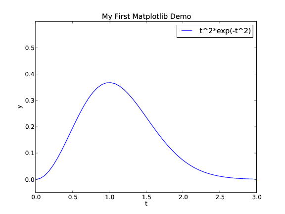
The \( x \) and \( y \) axes in curve plots should have labels, here \( t \) and
\( y \), respectively. Also, the curve should be identified with a label,
or legend as it is often called. A title above the plot is also
common. In addition, we may want to control the extent of the axes
(although most plotting programs will automatically adjust the axes to
the range of the data). All such things are easily added after the
plot command:
plot(t, y)
xlabel('t')
ylabel('y')
legend(['t^2*exp(-t^2)'])
axis([0, 3, -0.05, 0.6])   # [tmin, tmax, ymin, ymax]
title('My First Matplotlib Demo')
savefig('tmp2.pdf')
show()
show() call prevents the plot from being shown on the
screen, which is advantageous if the program's purpose is to make a
large number of plots in PDF or PNG format (you do not want all the
plot windows to appear on the screen and then kill all of them
manually). This decorated plot is displayed in Figure
3.
Figure 3: A single curve with label, title, and axis adjusted (Matplotlib).
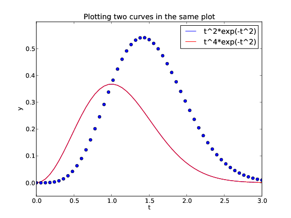
A common plotting task is to compare two or more curves, which
requires multiple curves to be drawn in the same plot.
Suppose we want to plot the two functions \( f_1(t)=t^2\exp(-t^2) \)
and \( f_2(t)=t^4\exp(-t^2) \). We can then just issue two plot commands,
one for each function. To make the syntax resemble MATLAB, we call
hold('on') after the first plot command to indicate that
subsequent plot commands are to draw the curves in the first plot.
def f1(t):
    return t**2*exp(-t**2)

def f2(t):
    return t**2*f1(t)

t = linspace(0, 3, 51)
y1 = f1(t)
y2 = f2(t)

plot(t, y1, 'r-')
hold('on')
plot(t, y2, 'bo')
xlabel('t')
ylabel('y')
legend(['t^2*exp(-t^2)', 't^4*exp(-t^2)'])
title('Plotting two curves in the same plot')
show()
plot commands, we have also specified the line type:
r- means red (r) line (-), while bo
means a blue (b) circle (o) at each data point.
Figure 4 shows the result.
The legends for each curve is specified in a list where the sequence
of strings correspond to the sequence of plot commands.
Doing a hold('off') makes the next plot command create a new
plot.
Figure 4: Two curves in the same plot (Matplotlib).
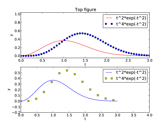
We may also put plots together in a figure with r rows
and c columns of plots. The subplot(r,c,a)
does this, where a is a row-wise counter for the individual plots.
Here is an example with two rows of plots, and one plot in each row,
(see Figure 5):
figure()  # make separate figure
subplot(2, 1, 1)
t = linspace(0, 3, 51)
y1 = f1(t)
y2 = f2(t)

plot(t, y1, 'r-', t, y2, 'bo')
xlabel('t')
ylabel('y')
axis([t[0], t[-1], min(y2)-0.05, max(y2)+0.5])
legend(['t^2*exp(-t^2)', 't^4*exp(-t^2)'])
title('Top figure')

subplot(2, 1, 2)
t3 = t[::4]
y3 = f2(t3)

plot(t, y1, 'b-', t3, y3, 'ys')
xlabel('t')
ylabel('y')
axis([0, 4, -0.2, 0.6])
legend(['t^2*exp(-t^2)', 't^4*exp(-t^2)'])
savefig('tmp4.pdf')
show()
figure() call creates a new plot window on the screen.
Figure 5: Example on two plots in one figure (Matplotlib).
All of the examples above on plotting with Matplotlib are collected in the file mpl_pylab_examples.py.
The Matplotlib developers do not promote the plotting style we
exemplified above.
Instead, they recommend to prefix plotting commands
by the matplotlib.pyplot module and also prefix
array computing commands to demonstrate that they come from
Numerical Python:
import numpy as np
import matplotlib.pyplot as plt
plt:
plt.plot(t, y)
plt.legend(['t^2*exp(-t^2)'])
plt.xlabel('t')
plt.ylabel('y')
plt.axis([0, 3, -0.05, 0.6])   # [tmin, tmax, ymin, ymax]
plt.title('My First Matplotlib Demo')
plt.show()
plt.savefig('tmp2.pdf') # produce PDF
plt.plot(t, y, label='t^2*exp(-t^2)')
legend command since
this makes the transition to/from MATLAB easier.
Figure 4 can be produced by
def f1(t):
    return t**2*np.exp(-t**2)

def f2(t):
    return t**2*f1(t)

t = np.linspace(0, 3, 51)
y1 = f1(t)
y2 = f2(t)

plt.plot(t, y1, 'r-')
plt.plot(t, y2, 'bo')
plt.xlabel('t')
plt.ylabel('y')
plt.legend(['t^2*exp(-t^2)', 't^4*exp(-t^2)'])
plt.title('Plotting two curves in the same plot')
plt.savefig('tmp3.pdf')
plt.show()
subplot as previously shown,
except that commands are prefixed by plt.
The complete example, along with the codes listed above, are found in
the file mpl_pyplot_examples.py.
Once you have created a basic plot, there are numerous possibilities for fine-tuning the figure, i.e., adjusting tick marks on the axis, inserting text, etc. The Matplotlib website is full of instructive examples on what you can do with this excellent package.
Matplotlib has become the de facto standard for curve plotting in Python, but there are several other alternative packages, especially if we also consider plotting of 2D/3D scalar and vector fields. Python has interfaces to many leading visualization packages: MATLAB, Gnuplot, Grace, OpenDX, and VTK. Even basic plotting with these packages has very different syntax, and deciding what package and syntax to go with was and still is a challenge. As a response to this challenge, Easyviz was created to provide a common uniform interface to all the mentioned visualization packages (including Matplotlib). The syntax of this interface was made very close to that of MATLAB, since most scientists and engineers have experience with MATLAB or most probably will be using it in some context. (In general, the Python syntax used in the examples in this document is constructed to ease the transition to and from MATLAB.)
Easyviz is part of the SciTools package, which consists of a set of Python tools building on Numerical Python, ScientificPython, the comprehensive SciPy environment, and other packages for scientific computing with Python. SciTools contains in particular software related to the document [2] and the present text. Installation is straightforward as described on the web page https://github.com/hplgit/scitools.
A standard import of SciTools is
from scitools.std import *
numpy (from numpy import
*), all of scipy (from scipy import *) if available, the
StringFunction tool (see the document User input and error
handling [3]),
many mathematical functions and tools in SciTools, plus commonly
applied modules such as sys, os, and math. The imported
standard mathematical functions (sqrt, sin, asin, exp, etc.)
are from numpy.lib.scimath and deal transparently with real and
complex input/output (as the corresponding MATLAB functions):
>>> from scitools.std import *
>>> a = array([-4., 4])
>>> sqrt(a)                 # need complex output
array([ 0.+2.j,  2.+0.j])
>>> a = array([16., 4])
>>> sqrt(a)                 # can reduce to real output
array([ 4.,  2.])
The inverse trigonometric functions have different names in math and
numpy, a fact that prevents an expression written for scalars, using
math names, to be immediately valid for arrays. Therefore, the
from scitools.std import * action also imports the names asin,
acos, and atan for the numpy or scipy
names arcsin, arccos, and
arctan functions, to ease vectorization of mathematical expressions
involving inverse trigonometric functions.
The downside of the "star import" from scitools.std is twofold.
First, it fills up your program or interactive session with the names
of several hundred functions. Second, when using a particular
function, you do not know the package it comes from. Both problems are
solved by doing an import of the type used in the section Matplotlib; pyplot prefix:
import scitools.std as st
import numpy as np
st. Although the numpy functions are available through the st
prefix, we recommend using the np prefix to clearly see where
functionality comes from.
Since the Easyviz syntax for plotting is very close to that of MATLAB, it is also very close to the syntax of Matplotlib shown earlier. This will be demonstrated in the forthcoming examples. The advantage of using Easyviz is that the underlying plotting package, used to create the graphics and known as a backend, can trivially be replaced by another package. If users of your Python software have not installed a particular visualization package, the software can still be used with another alternative (which might be considerably easier to install). By default, Easyviz now employs Matplotlib for plotting. Other popular alternatives are Gnuplot and MATLAB. For 2D/3D scalar and vector fields, VTK is a popular backend for Easyviz.
We shall next redo the curve plotting examples from the section MATLAB-style plotting with Matplotlib using Easyviz syntax.
Plotting the curve \( y = t^2\exp(-t^2) \) for \( t\in [0,3] \), using 31 equally spaced points (30 intervals) is performed by like this:
from scitools.std import *

def f(t):
    return t**2*exp(-t**2)

t = linspace(0, 3, 31)
y = f(t)
plot(t, y, '-')
savefig function, which takes
the filename as argument:
savefig('tmp1.pdf') # produce PDF
savefig('tmp1.eps') # produce PostScript
savefig('tmp1.png') # produce PNG
.pdf for PDF, .ps or
.eps for PostScript, and .png for PNG.
A synonym for the savefig function is hardcopy.
On some platforms, some backends may result in a plot that is shown in just a fraction of a second on the screen before the plot window disappears (the Gnuplot backend on Windows machines and the Matplotlib backend constitute two examples). To make the window stay on the screen, add
raw_input('Press the Return key to quit: ')
Let us plot the same curve, but now with a legend, a plot title, labels on the axes, and specified ranges of the axes:
from scitools.std import *

def f(t):
    return t**2*exp(-t**2)

t = linspace(0, 3, 31)
y = f(t)
plot(t, y, '-')
xlabel('t')
ylabel('y')
legend('t^2*exp(-t^2)')
axis([0, 3, -0.05, 0.6])   # [tmin, tmax, ymin, ymax]
title('My First Easyviz Demo')
Easyviz has also introduced a more Pythonic plot command where all
the plot properties can be set at once through keyword arguments:
plot(t, y, '-',
     xlabel='t',
     ylabel='y',
     legend='t^2*exp(-t^2)',
     axis=[0, 3, -0.05, 0.6],
     title='My First Easyviz Demo',
     savefig='tmp1.pdf',
     show=True)
With show=False one can avoid the plot window on the screen and
just make the plot file.
Note that we in the curve legend write t square as t^2 ({\LaTeX}
style) rather than t**2 (program style). Whichever form you choose
is up to you, but the {\LaTeX} form sometimes looks better in some
plotting programs (Matplotlib and Gnuplot are two examples).
Next we want to compare the two functions \( f_1(t)=t^2\exp(-t^2) \) and
\( f_2(t)=t^4\exp(-t^2) \). Writing two plot commands after each other
makes two separate plots. To make the second curve appear together
with the first one, we need to issue a hold('on') call after the
first plot command. All subsequent plot commands will then draw
curves in the same plot, until hold('off') is called.
from scitools.std import *

def f1(t):
    return t**2*exp(-t**2)

def f2(t):
    return t**2*f1(t)

t = linspace(0, 3, 51)
y1 = f1(t)
y2 = f2(t)

plot(t, y1, 'r-')
hold('on')
plot(t, y2, 'b-')

xlabel('t')
ylabel('y')
legend('t^2*exp(-t^2)', 't^4*exp(-t^2)')
title('Plotting two curves in the same plot')
savefig('tmp3.pdf')
Instead of separate calls to plot and the use of hold('on'),
we can do everything at once and just send several curves to plot:
plot(t, y1, 'r-', t, y2, 'b-', xlabel='t', ylabel='y',
     legend=('t^2*exp(-t^2)', 't^4*exp(-t^2)'),
     title='Plotting two curves in the same plot',
     savefig='tmp3.pdf')
plot command, which also only requires an import of
the form from scitools.std import plot.
Easyviz applies Matplotlib for plotting by default, so the resulting figures so far will be similar to those of Figure 2-4.
However, we can use other backends (plotting packages) for creating the graphics. The specification of what package to use is defined in a configuration file (see the heading Setting Parameters in the Configuration File in the Easyviz documentation), or on the command line:
Terminal> python myprog.py --SCITOOLS_easyviz_backend gnuplot
myprog.py will make use of Gnuplot
to create the graphics, with a slightly different result than that
created by Matplotlib (compare Figures 4 and
6). A nice feature of Gnuplot is that the line types
are automatically changed if we save a figure to file, such that
the lines are easily distinguishable in a black-and-white plot.
With Matplotlib one has to carefully set the line types to make
them effective on a grayscale.
Figure 6: Two curves in the same plot (Gnuplot).

Finally, we redo the example from the section MATLAB-style plotting with Matplotlib where
two plots are combined into one figure, using the subplot command:
figure()
subplot(2, 1, 1)
t = linspace(0, 3, 51)
y1 = f1(t)
y2 = f2(t)
plot(t, y1, 'r-', t, y2, 'bo', xlabel='t', ylabel='y',
     legend=('t^2*exp(-t^2)', 't^4*exp(-t^2)'),
     axis=[t[0], t[-1], min(y2)-0.05, max(y2)+0.5],
     title='Top figure')

subplot(2, 1, 2)
t3 = t[::4]
y3 = f2(t3)

plot(t, y1, 'b-', t3, y3, 'ys',
     xlabel='t', ylabel='y',
     axis=[0, 4, -0.2, 0.6],
     legend=('t^2*exp(-t^2)', 't^4*exp(-t^2)'))
savefig('tmp4.pdf')
figure() must be used if you want a program to make
different plot windows on the screen: each figure() call
creates a new, separate plot.
All of the Easyviz examples above are found in the file
easyviz_examples.py.
We remark that Easyviz is just a thin layer of
code providing access to the most common plotting functionality for
curves as well as 2D/3D scalar and vector fields. Fine-tuning of
plots, e.g., specifying tick marks on the axes, is not supported,
simply because most of the curve plots in the daily work can be made
without such functionality. For fine-tuning the plot with special
commands, you need to grab an object in Easyviz that communicates
directly with the underlying plotting package used to create the
graphics. With this object you can issue package-specific commands
and do whatever the underlying package allows you do. This is
explained in the Easyviz manual, which
also comes up by running pydoc scitools.easyviz. As soon as you
have digested the very basics of plotting, you are strongly recommend
to read through the curve plotting part of the Easyviz manual.
In recent years, there have been several attempts to build new plotting libraries in Python, especially aimed at visualizations in web browser and handling "big data". Some packages are Pandas, Seaborn, Bokeh, ggplot, pygal, and Plotly, A comparison of these packages for creating bar charts is made in an article by Chris Moffitt. We must also mention the bqplot for powerful plotting in Jupyter notebooks.
A sequence of plots can be combined into an animation on the screen and stored in a video file. The standard procedure is to generate a series of individual plots and to show them in sequence to obtain an animation effect. Plots store in files can be combined to a video file.
The function
$$
\begin{equation*}
f(x; m, s) = (2\pi)^{-1/2}s^{-1}\exp{\left[-\frac{1}{2}\left({x-m\over s}\right)^2\right]}
\end{equation*}
$$
is known as the Gaussian function or the probability density function
of the normal (or Gaussian) distribution. This bell-shaped function
is wide for large \( s \) and peak-formed for small \( s \), see Figure
7. The function is symmetric around \( x=m \) (\( m=0 \) in the
figure). Our goal is to make an animation where we see how this
function evolves as \( s \) is decreased. In Python we implement the
formula above as a function f(x, m, s).
Figure 7: Different shapes of a Gaussian function.

The animation is created by varying \( s \) in a loop and for each \( s \)
issue a plot command. A moving curve is then visible on the screen.
One can also make a video that can be played as any other
computer movie using a standard movie player.
To this end, each plot
is saved to a file, and all the files are combined together using some
suitable tool to be explained later. Before going into
programming detail there is one key point to emphasize.
The underlying plotting program will normally adjust the axis to the maximum and minimum values of the curve if we do not specify the axis ranges explicitly. For an animation such automatic axis adjustment is misleading - any axis range must be fixed to avoid a jumping axis.
The relevant values for the \( y \) axis range in the present example is the minimum and maximum value of \( f \). The minimum value is zero, while the maximum value appears for \( x=m \) and increases with decreasing \( s \). The range of the \( y \) axis must therefore be \( [0,f(m; m, \min s)] \).
The function \( f \) is defined for all \( -\infty < x < \infty \), but the function value is very small already \( 3s \) away from \( x=m \). We may therefore limit the \( x \) coordinates to \( [m-3s,m+3s] \).
We start with using Easyviz for animation since this is almost identical to making standard static plots, and you can choose the plotting engine you want to use, say Gunplot or Matplotlib. The Easyviz recipe for animating the Gaussian function as \( s \) goes from 2 to 0.2 looks as follows.
from scitools.std import sqrt, pi, exp, linspace, plot, movie
import time

def f(x, m, s):
    return (1.0/(sqrt(2*pi)*s))*exp(-0.5*((x-m)/s)**2)

m = 0
s_min = 0.2
s_max = 2
x = linspace(m -3*s_max, m + 3*s_max, 1000)
s_values = linspace(s_max, s_min, 30)
# f is max for x=m; smaller s gives larger max value
max_f = f(m, m, s_min)

# Show the movie on the screen
# and make hardcopies of frames simultaneously.

counter = 0
for s in s_values:
    y = f(x, m, s)
    plot(x, y, '-', axis=[x[0], x[-1], -0.1, max_f],
         xlabel='x', ylabel='f', legend='s=%4.2f' % s,
         savefig='tmp%04d.png' % counter)
    counter += 1
    #time.sleep(0.2)  # can insert a pause to control movie speed
Note that the \( s \) values are decreasing (linspace handles this
automatically if the start value is greater than the stop value).
Also note that we, simply because we think it is visually more
attractive, let the \( y \) axis go from -0.1 although the \( f \) function is
always greater than zero. The complete code is found in the file
movie1.py.
It is crucial to use the single, compound plot command shown above,
where axis, labels, legends, etc., are set in the same call. Splitting
up in individual calls to plot, axis, and so forth, results in
jumping curves and axis. Also, when visualizing more than one animated
curve at a time, make sure you send all data to a single plot
command.
For each frame (plot) in the movie we store the plot in a file,
with the purpose of combining all the files to an ordinary video file.
The different files need different names such that various methods
for listing the files will list them in the correct order.
To this end, we recommend using filenames
of the form tmp0001.png, tmp0002.png, tmp0003.png, etc. The
printf format 04d pads the integers with zeros such that 1 becomes
0001, 13 becomes 0013 and so on. The expression tmp*.png will
now expand (by an alphabetic sort) to a list of all files in proper
order.
Without the padding with zeros, i.e., names of the form
tmp1.png, tmp2.png, ..., tmp12.png, etc., the alphabetic order
will give a wrong sequence of frames in the movie. For instance,
tmp12.png will appear before tmp2.png.
Animation is Matplotib requires more than a loop over a parameter and
making a plot inside the loop. The set-up that is closest to standard static
plots is shown first, while the newer and more widely used tool
FuncAnimation is explained afterwards.
The first part of the program, where we define f, x, s_values,
and so forth, is the same regardless of the animation
technique. Therefore, we concentrate on the graphics part here:
import matplotlib.pyplot as plt
...
# Make a first plot
plt.ion()
y = f(x, m, s_max)
lines = plt.plot(x, y)
plt.axis([x[0], x[-1], -0.1, max_f])
plt.xlabel('x')
plt.ylabel('f')

# Show the movie, and make hardcopies of frames simulatenously
counter = 0
for s in s_values:
    y = f(x, m, s)
    lines[0].set_ydata(y)
    plt.legend(['s=%4.2f' % s])
    plt.draw()
    plt.savefig('tmp_%04d.png' % counter)
    counter += 1
plt.ion() call is important, so is the first plot, where we grab
the result of the plot command, which is a list of Matplotlib's
Line2D objects. The idea is then to update the data via
lines[0].set_ydata and show the plot via plt.draw() for each
frame. For multiple curves we must update the \( y \) data for each curve,
e.g.,
lines = plot(x, y1, x, y2, x, y3)

for parameter in parameters:
    y1 = ...
    y2 = ...
    y3 = ...
    for line, y in zip(lines, [y1, y2, y3]):
        line.set_ydata(y)
    plt.draw()
The recommended approach to animation in Matplotlib is to use the
FuncAnimation tool:
import matplotlib.pyplot as plt
from matplotlib.animation import animation

anim = animation.FuncAnimation(
    fig, frame, all_args, interval=150, init_func=init, blit=True)
fig is the plt.figure() object for the current figure,
frame is a user-defined function for plotting each frame,
all_args is a list of arguments for frame, interval is
the delay in ms between each frame, init_func is a function
called for defining the background plot in the animation, and
blit=True speeds up the animation.
For frame number i, FuncAnimation will call
frame(all_args[i]). Hence, the user's task is mostly to write the
frame function and construct the all_args arguments.
After having defined m, s_max, s_min, s_values, and max_f
as shown earlier, we have to make a first plot:
fig = plt.figure()
plt.axis([x[0], x[-1], -0.1, max_f])
lines = plt.plot([], [])
plt.xlabel('x')
plt.ylabel('f')
plt.plot in lines such that
we can conveniently update the data for the curve(s) in each frame.
The function for defining a background plot draws an empty plot in this example:
def init():
    lines[0].set_data([], [])  # empty plot
    return lines
The function that defines the individual plots in the animation
basically computes y from f and updates the data of the curve:
def frame(args):
    frame_no, s, x, lines = args
    y = f(x, m, s)
    lines[0].set_data(x, y)
    return lines
We are now ready to call animation.FuncAnimation:
anim = animation.FuncAnimation(
    fig, frame, all_args, interval=150, init_func=init, blit=True)
A common next action is to make a video file, here in the MP4 format with 5 frames per second:
anim.save('movie1.mp4', fps=5) # movie in MP4 format
plt.show() as always to watch any plots on
the screen.
The video making requires additional software on the computer, such as
ffmpeg, and can fail. One gets more control over the potentially
fragile movie making process by explicitly saving plots to
file and explicitly running movie making programs like ffmeg
later. Such programs are explained in the section Making videos.
The complete code showing the basic use of
FuncAnimation is available in movie1_FuncAnimation.py.
There is also a MATLAB Animation
Tutorial
with more basic information, plus a set of animation examples on http://matplotlib.org/examples.
We strongly recommend removing previously generated plot files before a
new set of files is made. Otherwise, the movie may get old and new
files mixed up. The following Python code removes all files of the
form tmp*.png:
import glob, os
for filename in glob.glob('tmp*.png'):
    os.remove(filename)
Instead of deleting the individual plotfiles, one may store all plot files in a subfolder and later delete the subfolder. Here is a suitable code segment:
import shutil, os
subdir = 'temp'            # subfolder name for plot files
if os.path.isdir(subdir):  # does the subfolder already exist?
    shutil.rmtree(subdir)  # delete the whole folder
os.mkdir(subdir)           # make new subfolder
os.chdir(subdir)           # move to subfolder
# ... perform all the plotting, make movie ...
os.chdir(os.pardir)        # optional: move up to parent folder
dir for directory.
Suppose we have a set of frames in an animation, saved
as plot files tmp_*.png. The filenames are generated by
the printf syntax 'tmp_%04d.png' % i, using a frame counter i
that goes from 0 to some value. The corresponding files are then
tmp_0000.png, tmp_0001.png, tmp_0002.png, and so on.
Several tools can be used to create videos in common formats from
the individual frames in the plot files.
The ImageMagick software suite contains
a program convert for making animated GIF files:
Terminal> convert -delay 50 tmp_*.png movie.gif
movie.gif can be viewed by another
program in the ImageMagick suite: animate movie.gif, but the
most common way of displaying animated GIF files is to include them
in web pages. Writing the HTML code
<img src="movie.gif">
.html and loading this file into a
web browser will play the movie repeatedly.
You may try this out online.
The modern video formats that are best suited for being displayed
in web browsers are MP4, Ogg, WebM, and Flash. The program ffmpeg, or
the almost equivalent avconv, is a common tool to create such
movies. Creating a flash video is done by
Terminal> ffmpeg -i tmp_%04d.png -r 5 -vcodec flv movie.flv
-i option
specifies the printf string that was used to make the names of the
individual plot files,
-r specifies the number of frames per second, here 5,
-vcodec is the video codec for Flash,
which is called flv, and the final argument is the name of the
video file. On Debian Linux systems, such as Ubuntu, you use
the avconv program instead of ffmpeg.
Other formats are created in the same way, but we need to specify the codec and use the right extension in the video file:
| Format | Codec and filename |
|---|---|
| Flash | -vcodec flv movie.flv |
| MP4 | -vcodec libx264 movie.mp4 |
| Webm | -vcodec libvpx movie.webm |
| Ogg | -vcodec libtheora movie.ogg |
Video files are normally trivial to play in graphical file
browser: double lick
the filename or right-click and choose a player. On Linux systems there
are several players that can be run from the command line, e.g.,
vlc, mplayer, gxine, and totem.
It is easy to create the video file from a Python program since we
can run any operating system command in (e.g.) os.system:
cmd = 'convert -delay 50 tmp_*.png movie.gif'
os.system(cmd)
It might happen that your downloaded and installed version of
ffmpeg fails to generate videos in some of the mentioned
formats. The reason is that ffmpeg depends on many other
packages that may be missing on your system.
Getting ffmpeg to work with the libx264 codec
for making MP4 files is often challenging. On Debian-based
Linux systems, such as Ubuntu, the installation procedure at
the time of this writing goes like
Terminal> sudo apt-get install lib-avtools libavcodec-extra-53 \
          libx264-dev
Sometimes it can be desirable to show a graph in pure ASCII text,
e.g., as part of a trial run of a program included in the program
itself, or a graph that can be illustrative in a doc string. For such
purposes we have slightly extended a module by Imri Goldberg
(aplotter.py) and included it as a module in SciTools. Running
pydoc on scitools.aplotter describes the capabilities of this type
of primitive plotting. Here we just give an example of what it can do:
>>> import numpy as np
>>> x = np.linspace(-2, 2, 81)
>>> y = np.exp(-0.5*x**2)*np.cos(np.pi*x)
>>> from scitools.aplotter import plot
>>> plot(x, y)
                                        |
                                       -+1
                                     // |\\
                                    /   |  \
                                   /    |   \
                                  /     |   \
                                  /     |    \
                                 /      |     \
                                /       |      \
                               /        |      \
   -------\                    /        |       \
---+-------\\-----------------/---------+--------\-----------------/
   -2        \                /         |        \                /
              \\              /         |         \             //
                \            /          |         \            /
                 \\         /           |          \         //
                   \       /            |           \       /
                    \    //             |            \-    //
                     ----               -0.63          ---/